My role
I was there at the beginning of hearth. together with a product owner who joined a month before me.
We're given an open brief - to help Nationwide (as a company that has mostly middle-aged onward customers) understand young renters' financial behaviours and generate insights to help create the company's future profitable services, with Open Banking.
This is my first role as part of a product leadership team. As well as hands-on designing an end-to-end product, I had to quickly learn to shape the product strategy and roadmap, influence others with creative vision and build a design team from scratch.
RESPONSIBILITIES /
Design strategy and roadmap. Research, facilitation, conception, ideation, end-to-end user flows, prototype and testing. Recruitment and design ops.
TIMELINE & OUTPUT /
1-month concept design and 6-month MVP (web app) launch. 10-month native app build.
TEAM /
A product owner, a UX researcher, a marketer (content), 1-3 designers, 2 tech leads. The MVP was co-built with CloudThing (a software company) devs.
Defining the problem
To design a product that young renters (professionals) are willing to share their financial data with is challenging.
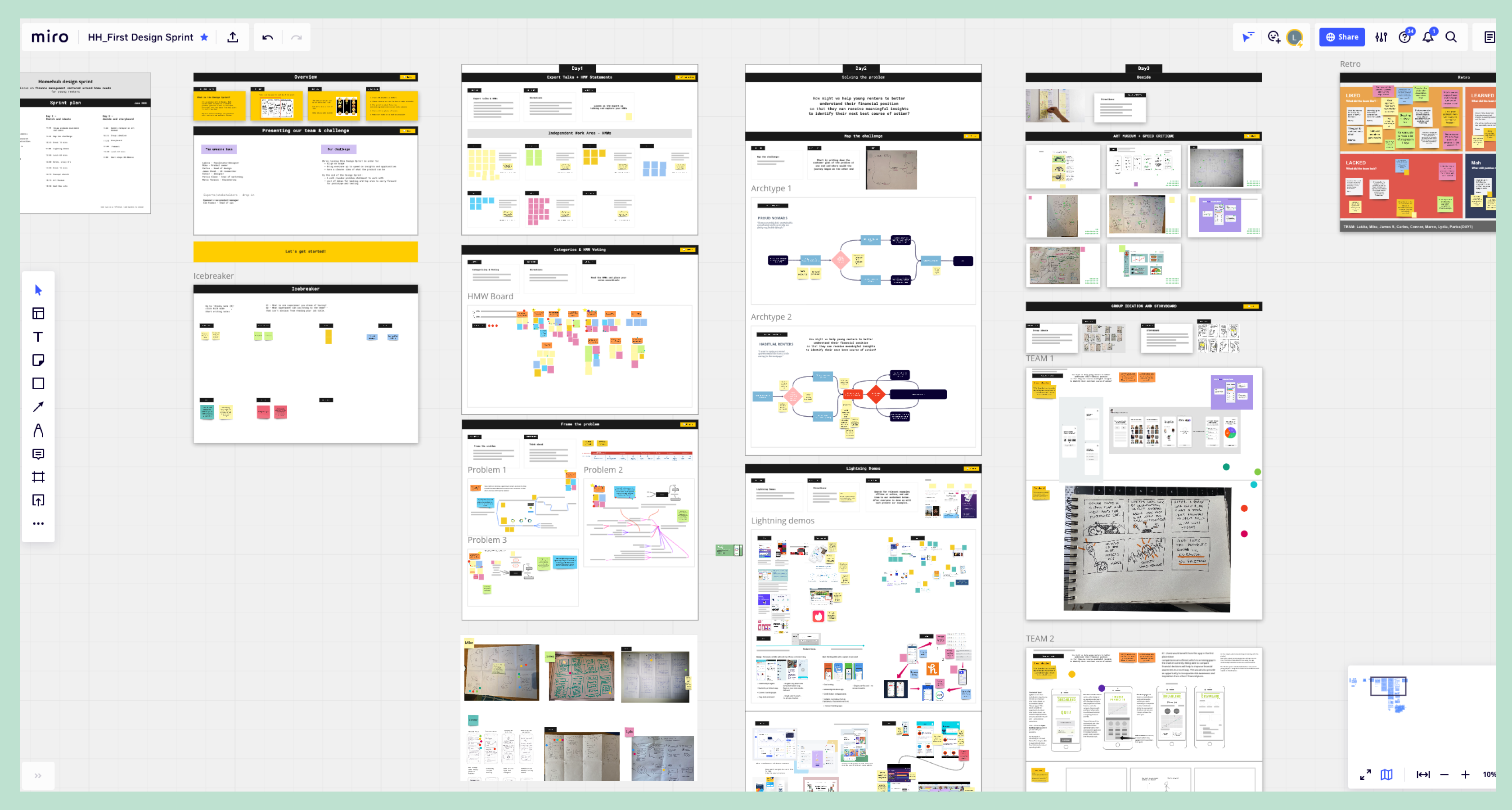
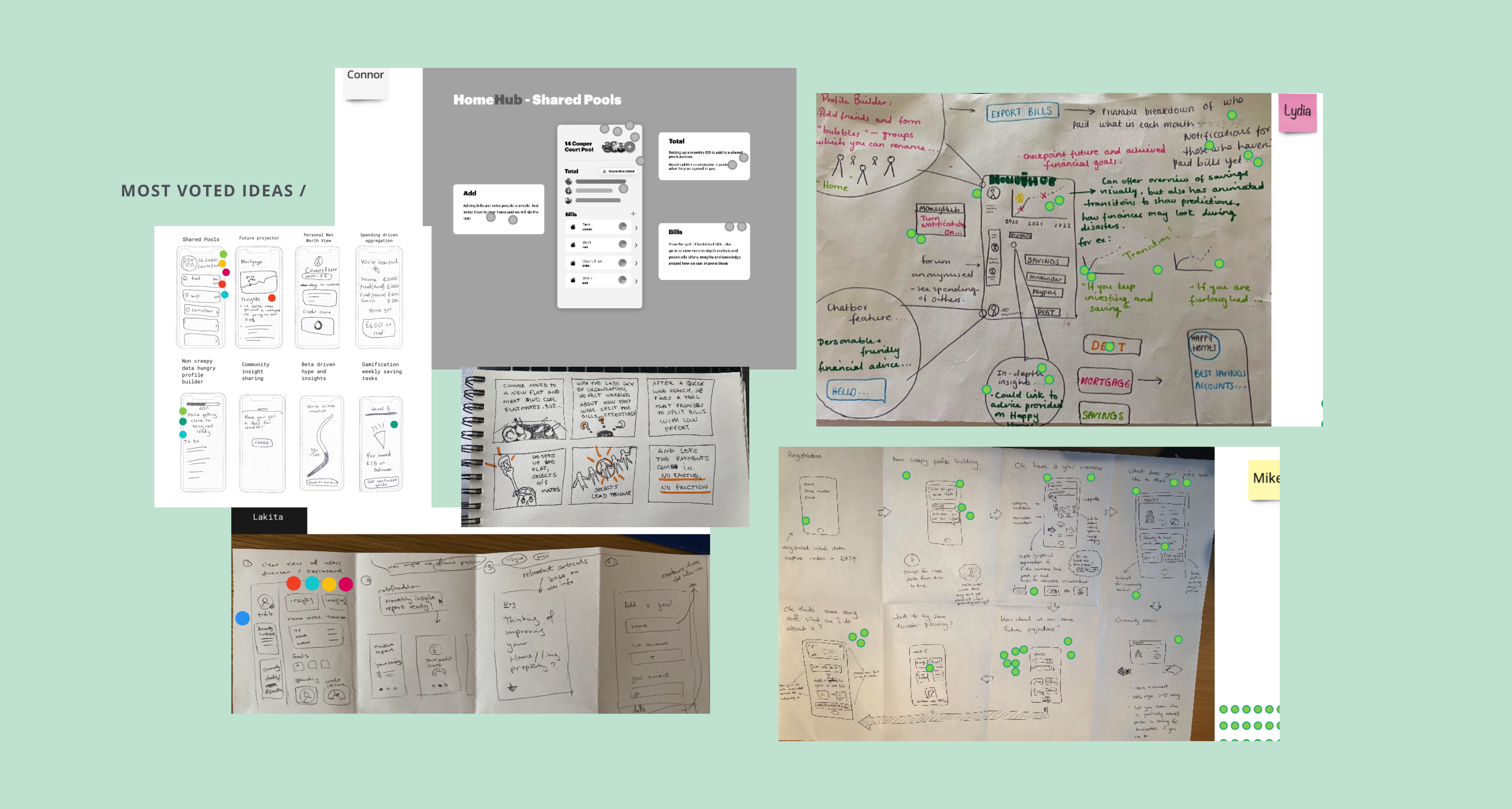
The team was in an uncertain state when I joined. None of the opportunities identified (through discovery research by McKinsey) was in favour of the business. With enough research and business info gathered, I kicked off a 3-day design sprint to quickly help the team re-align, define the problem and ideate potential routes.
The problem statement we landed on that satisfies both business and user needs:
"How might we help young renters better understand their financial situation so that they can identify the next best course of action?"
A number of factors have an influence on this, key ones being young renters who houseshare has a very common pain point of shared bills management, and that realising their current financial state clearly with the guidance of growth for future goals is desirable.
Ideating a new concept & system
At this point, the team believed we have to create a versatile product tackling multiple angles of money to add real value to young renters.
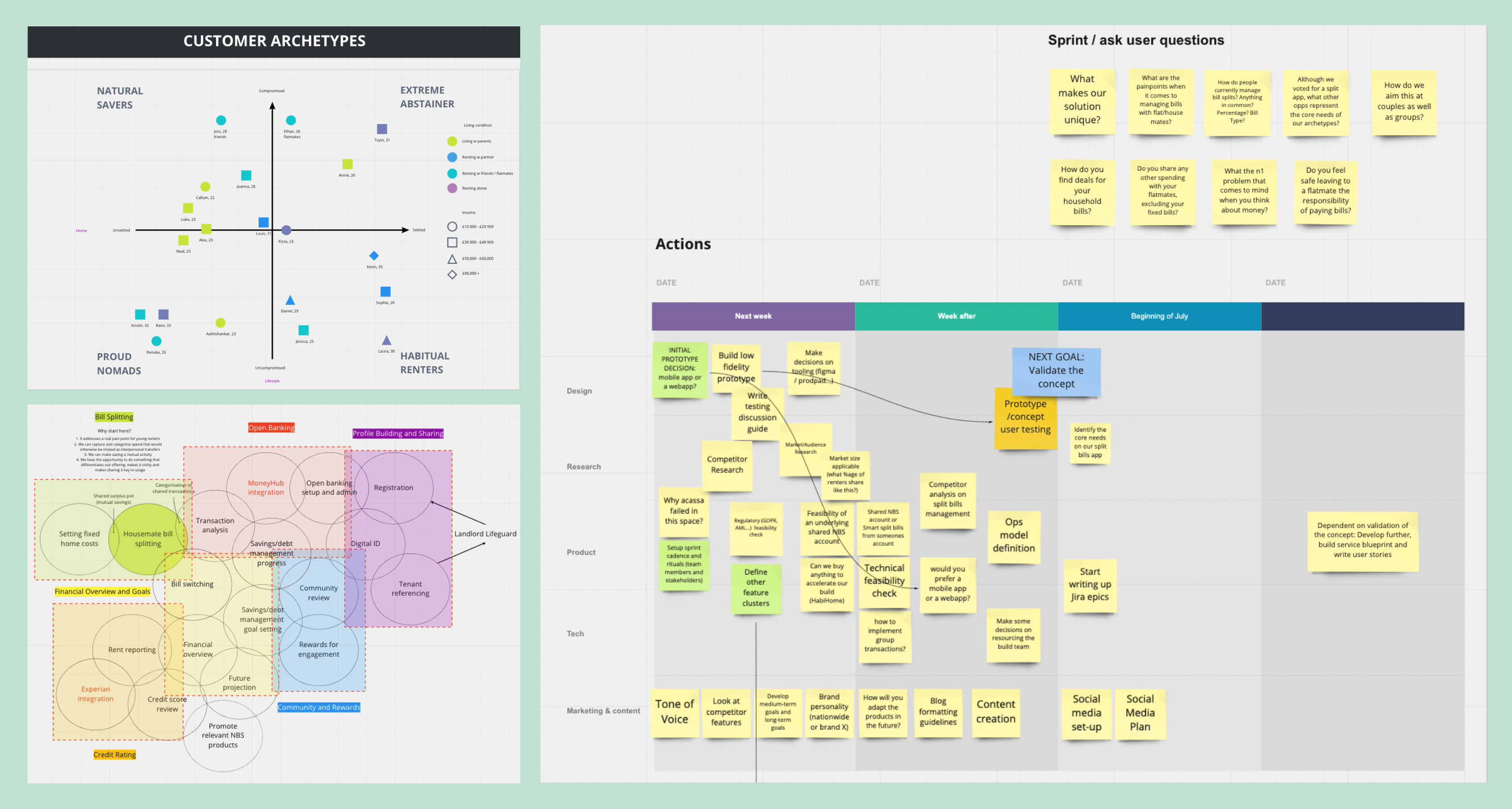
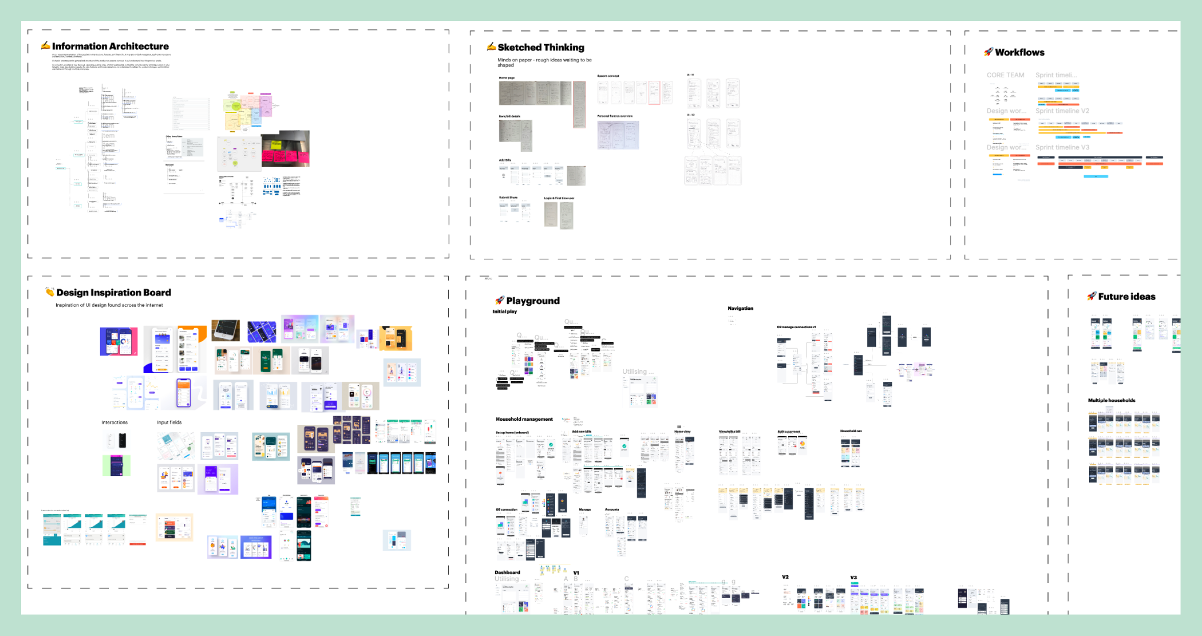
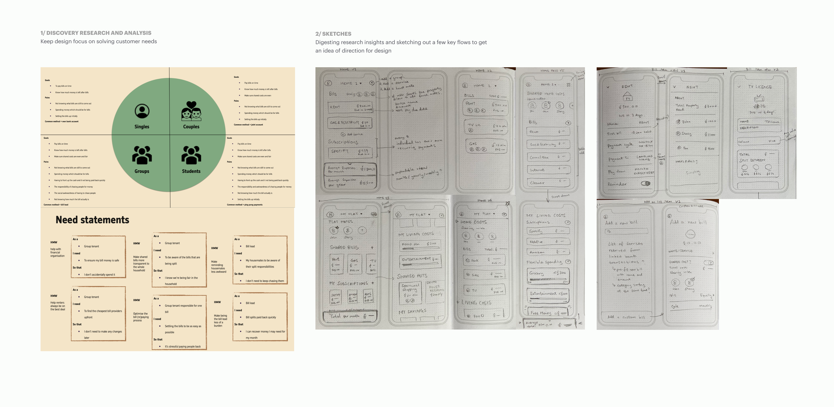
In the following 2 weeks, together with a Junior Designer, we further analysed customer archetypes, competitors; we sketched and wireframed just enough concepts to work out how ideas can make sense under one roof; and drafted the initial version of IA.
The outcomes were then discussed with the core team and made ready to be challenged by the target users.
*Collaboration with product, tech and marketing throughout this process - making rapid decisions and shaping concepts.
Early test and iterate x n
With the help of a UX researcher, we spoke to target users regularly for 5 months to shape the MVP, with a variety of research and testing methods used.
GOAL 1 ↓
Provide users with clarity of their finance now
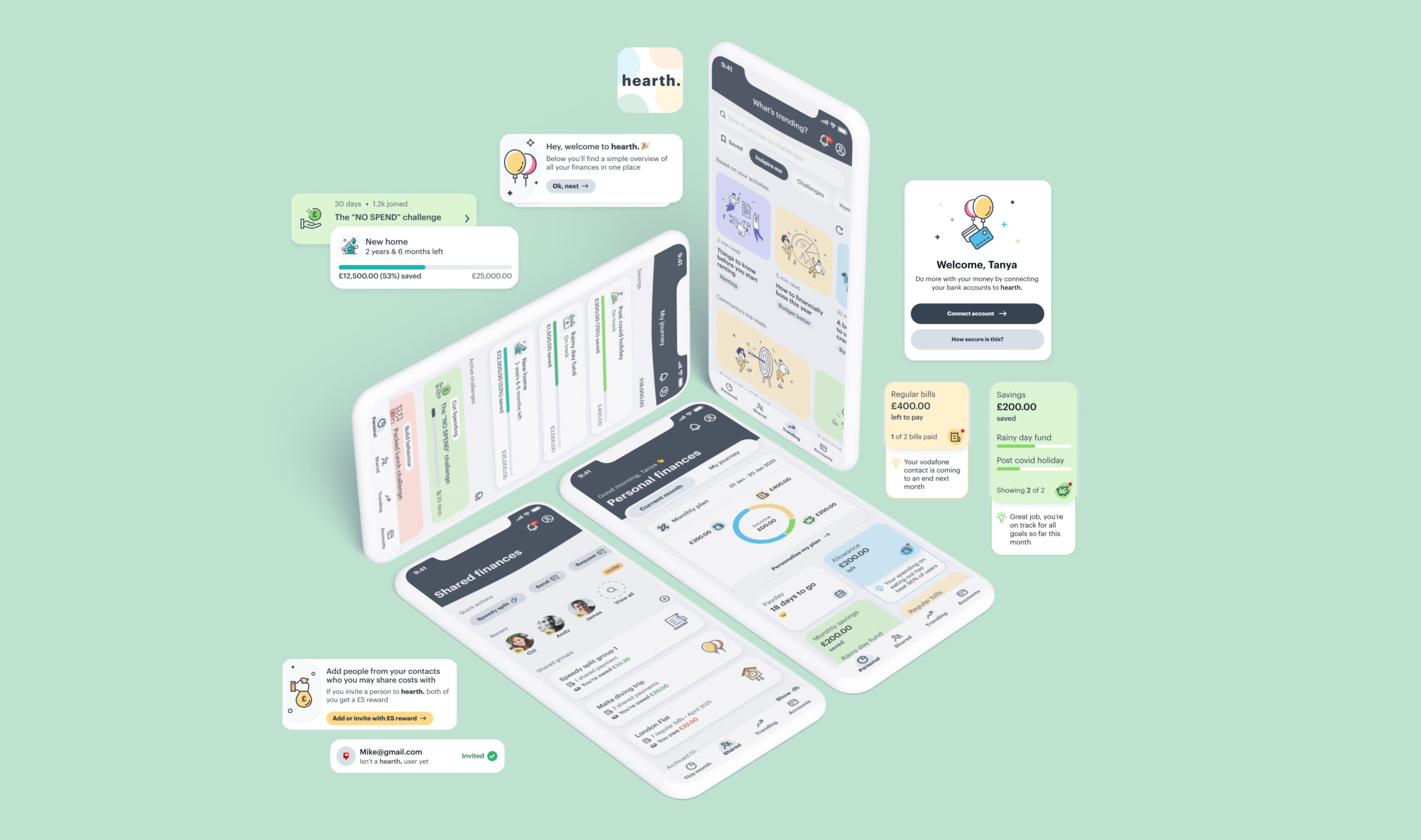
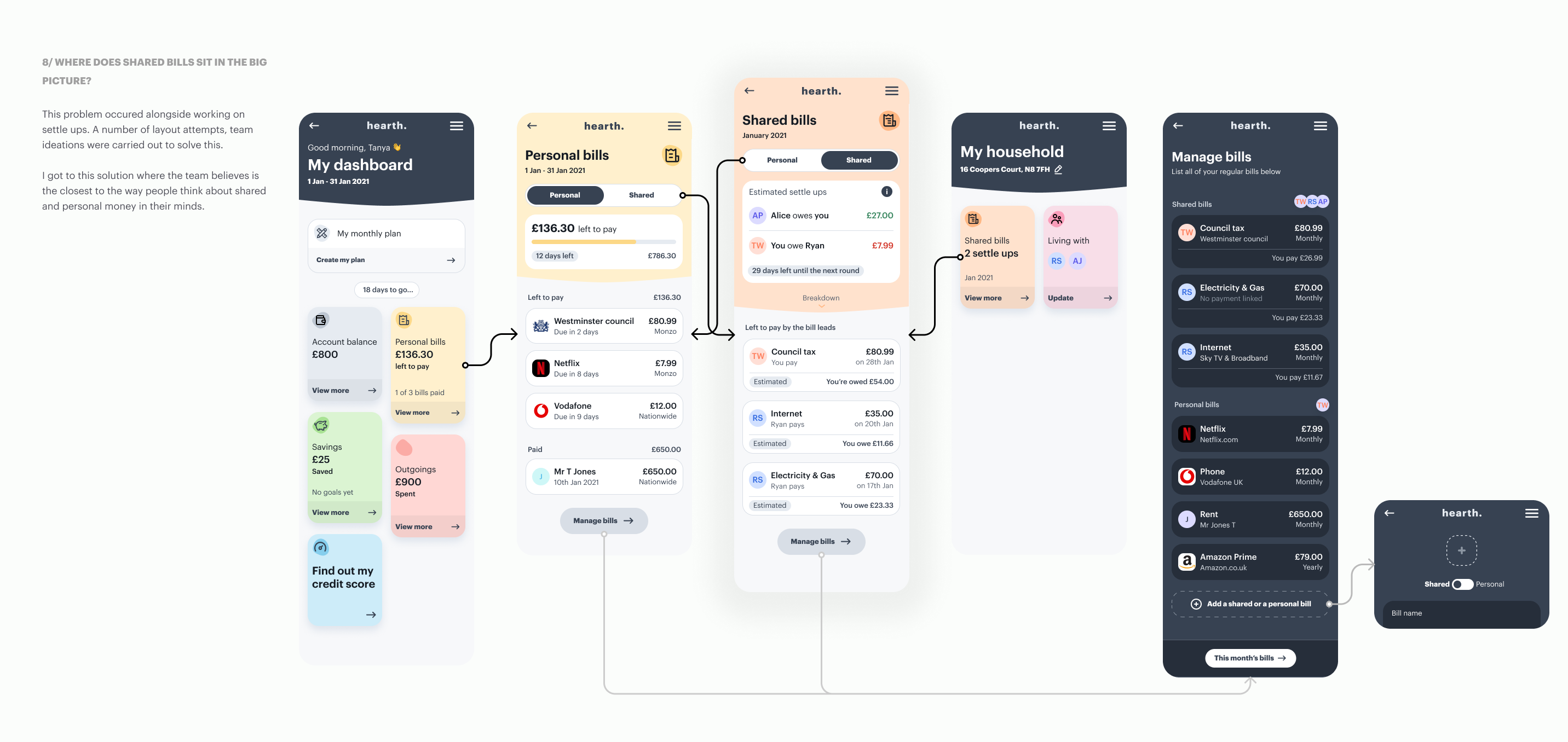
The dashboard (landing) page is certainly the most time spent designing and tested area of the app.
It was a great starting point as it kicked off the team thinking about all type of situations users could be in, the relationship between money and mental wellbeing, and the pain points in money management.
This page wasn't designed in isolation. Each second level journeys were thought through at the same time. Some sketched, some made into prototypes and tested, to help make design decisions on a whole.
This approach also helped to set the roadmap later down the line when more designers joined.
GOAL 2 ↓
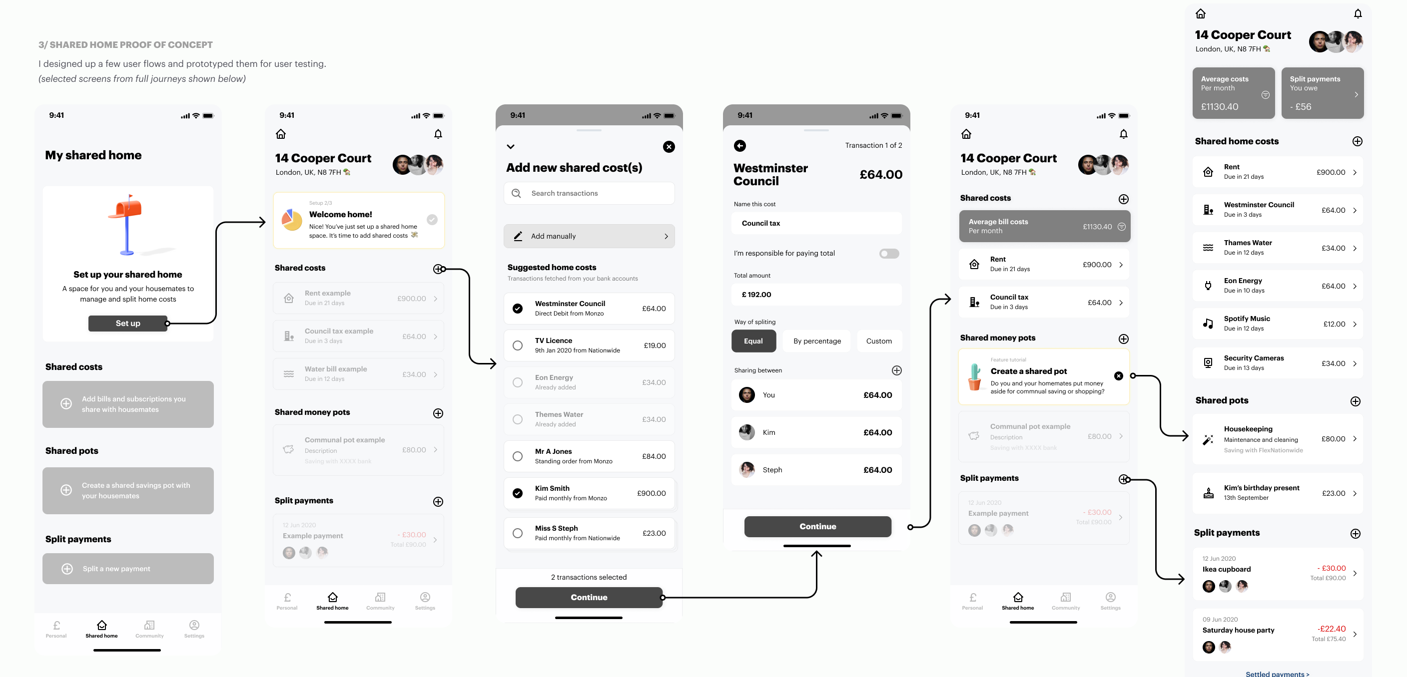
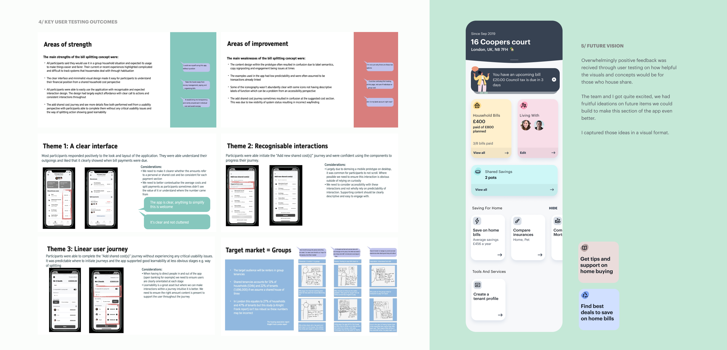
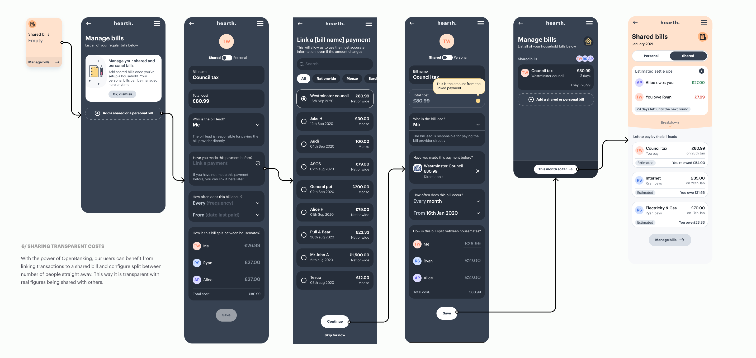
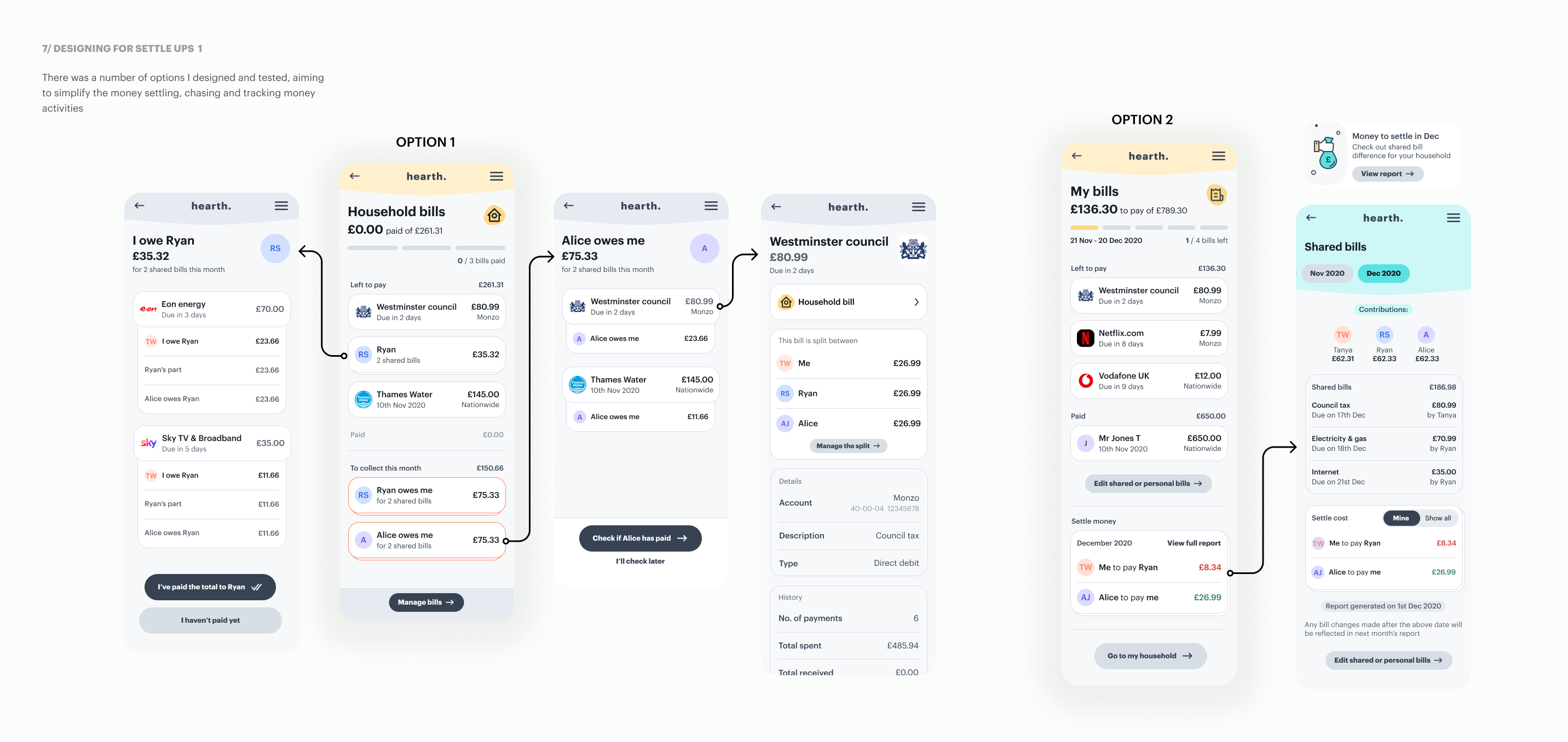
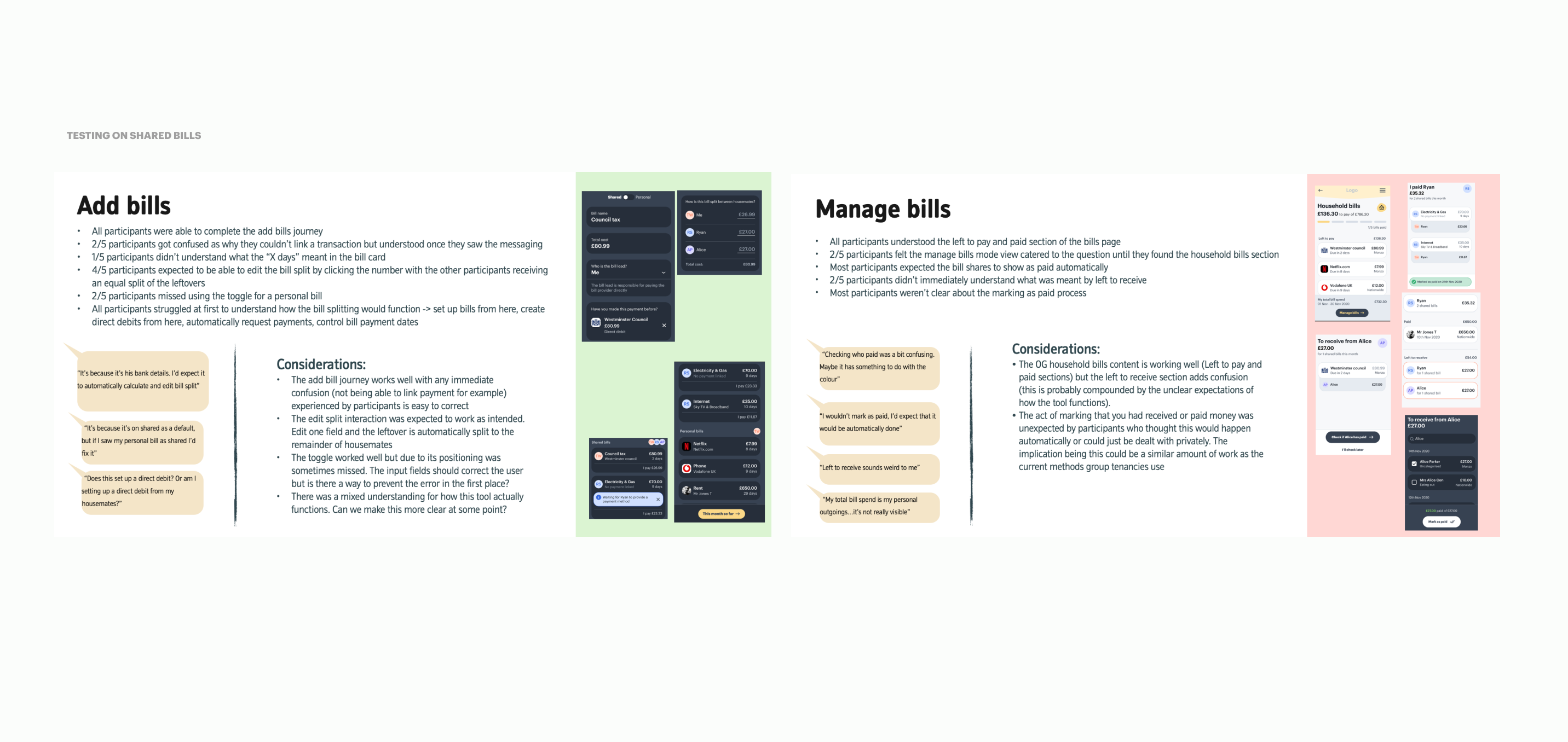
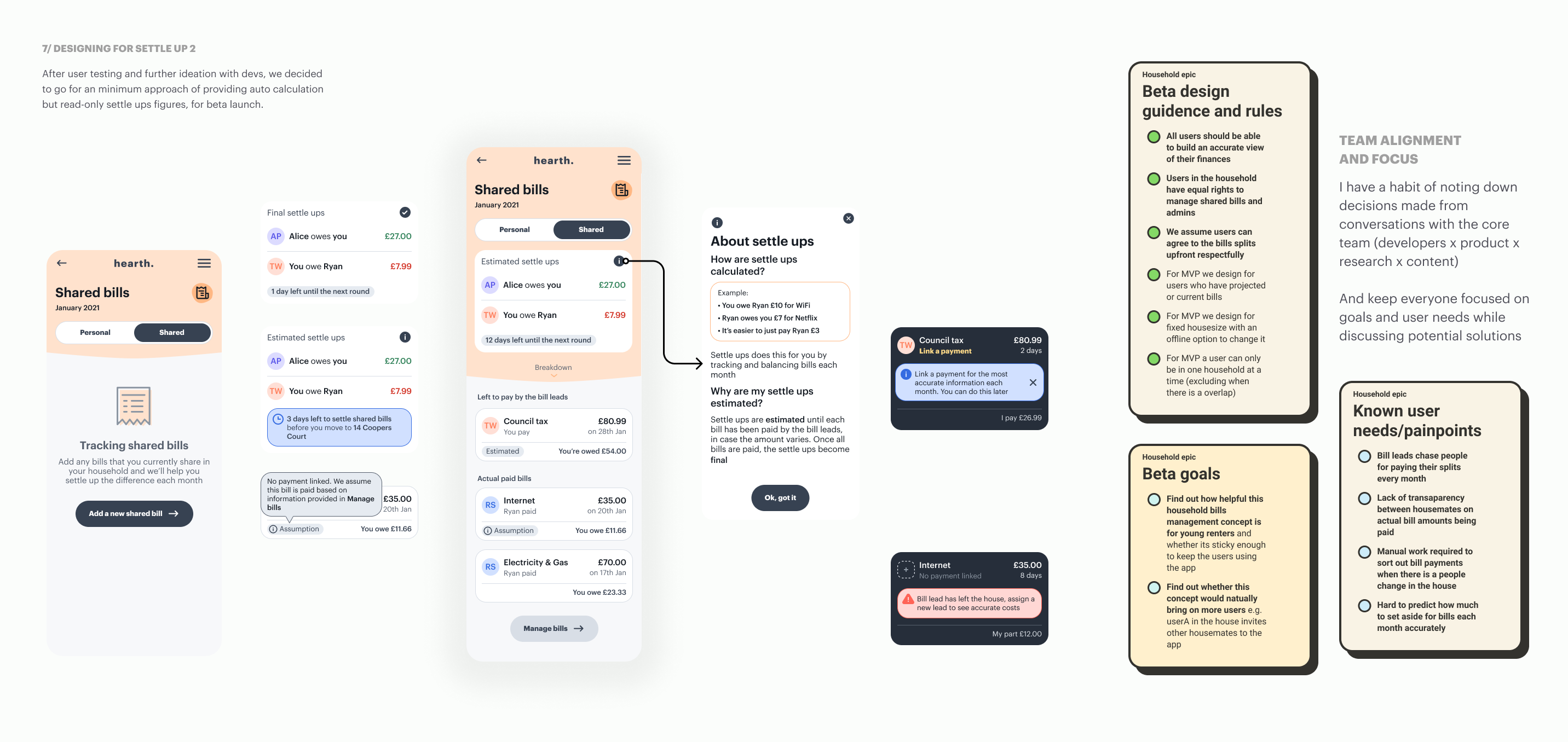
Untangle the shared part of users' finance
Through discovery research we found that most young renters who share living with others, find finances harder to control, some even find it stressful and anxious when dealing with shared costs. *This also plays a part in solving Goal 01
This is mainly caused by a lack of transparency on actual costs, having to deal with money chasing and others not paying on time.
↓ Drag horizontally to see more slides
GOAL 3 ↓
Get in control of where the money goes
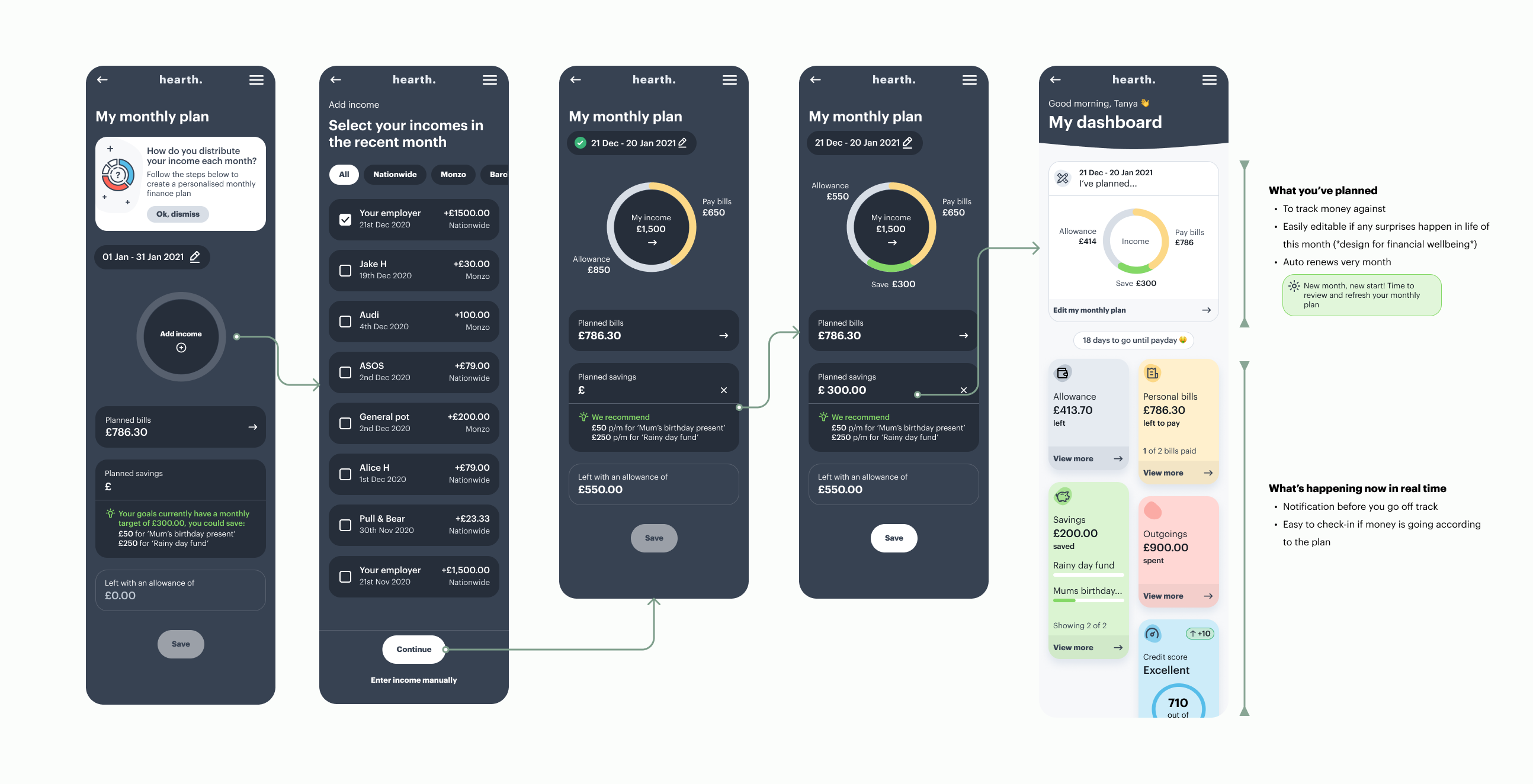
Part 1 - Monthly plan
This is a feature born from user research observations. We found a common pattern where people tend to sort salary into 4 chunks - savings, fixed bills, flexible essential costs and free to spends (allowance).
However, things don't stick to the plan when it's loose. Users explained how easy it is to lose track of where money is spent and opportunities for saving. The monthly plan is aimed to help users stick to the commitments, track progress against and find room for saving.
Part 2 - Spending insights
When we talk about 'data' being the transactions, spending insights should give the 'so what'.
The challenge here was to present insights in an engaging way that motivates users to take action and build better financial behavior.
*People's emotions towards money ups and downs are also taken into account when working through insight messages with Content. We took extra care of the tone of voice for the negatives.
Part 3 - Transaction management
Data accuracy is absolutely essential to the product being insightful and valuable.
I worked closely with tech to understand the transaction APIs and tech gaps. We co-designed functionalities that help to minimise false figures showing in the front end, at a number of touch points.
GOAL 4 ↓
Reaching for goals
We found multiple types of money goals people generally try to achieve. However, goals are less likely to last to completion when they loosely live in people's heads and not giving much attention to.
I attempted to solve this by formalising the goals with engaging interactions, the ability to track and be reminded throughout the cycle.
*Goals epic was later handed over to another designer to complete for the MVP launch.
Launching the MVP (pilot)
MY PRE-LAUNCH TASKS /
1) Supporting two other designers finalise journeys on time.
2) Working with developers to ensure the designs are built with quality.
3) Discussing the pilot details with the Researcher and Data Scientist e.g. research methods, themes, questions and use of analytics tools.
4) Creating a website and the onboarding experience for pilot users, in collaboration with the marketing team.
PILOT OBJECTIVES /
+ To test the technical delivery of the web app and reliability of API and services provided by MoneyHub (third party)
+ To get feedback on the experience of the app and its features so that we can make improvements for the next phase
+ To refine our knowledge of our users and their needs
*We planned for 50 recruited users to be on the platform initially, with the freedom to invite housemates to the app.
Apply learnings to native app design
The longitudinal study for the MVP ran for 3 months. We used adobe analytics for behavioural data in-app, regular surveys and interviews for attitudinal data, and a tree test for IA validation.
01 ITERATION /
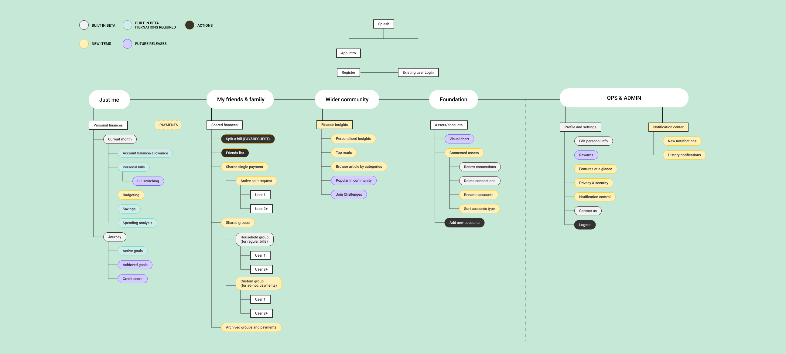
Match app IA with users' thinking modal
Re-structuring the app IA is the first activity I got hands-on after studying the MVP outcomes. A number of observations (right) and tree-test results lead me to the new IA.
1. Users' desire for more shared finance control, with wider friends as well as household members.
2. Users talk about short-term money management and long-term financial goals like different topics and think about them at different times. In MVP we had the two presented together at places e.g. 'Goals' within the 'Monthly Savings' section, which limits users' thinking on just 'what I can achieve this month'. There is an opportunity to inspire users on possible achievements longer term, and realise what can be done 'now' that impacts the 'future'.
3. The loneliness, anxiety and uncertainty when people speak about money surprised us. Together with the core team, we agreed to bring in the 'community' element - aim to help build financial wellbeing for our users.
*I used the new IA and wireframes as a point of discussion with stakeholders and the team. It worked nicely as a kick-off 'native app' phase source for the core team. We kept coming back to this throughout the new phase and adjusting it as we learn more.
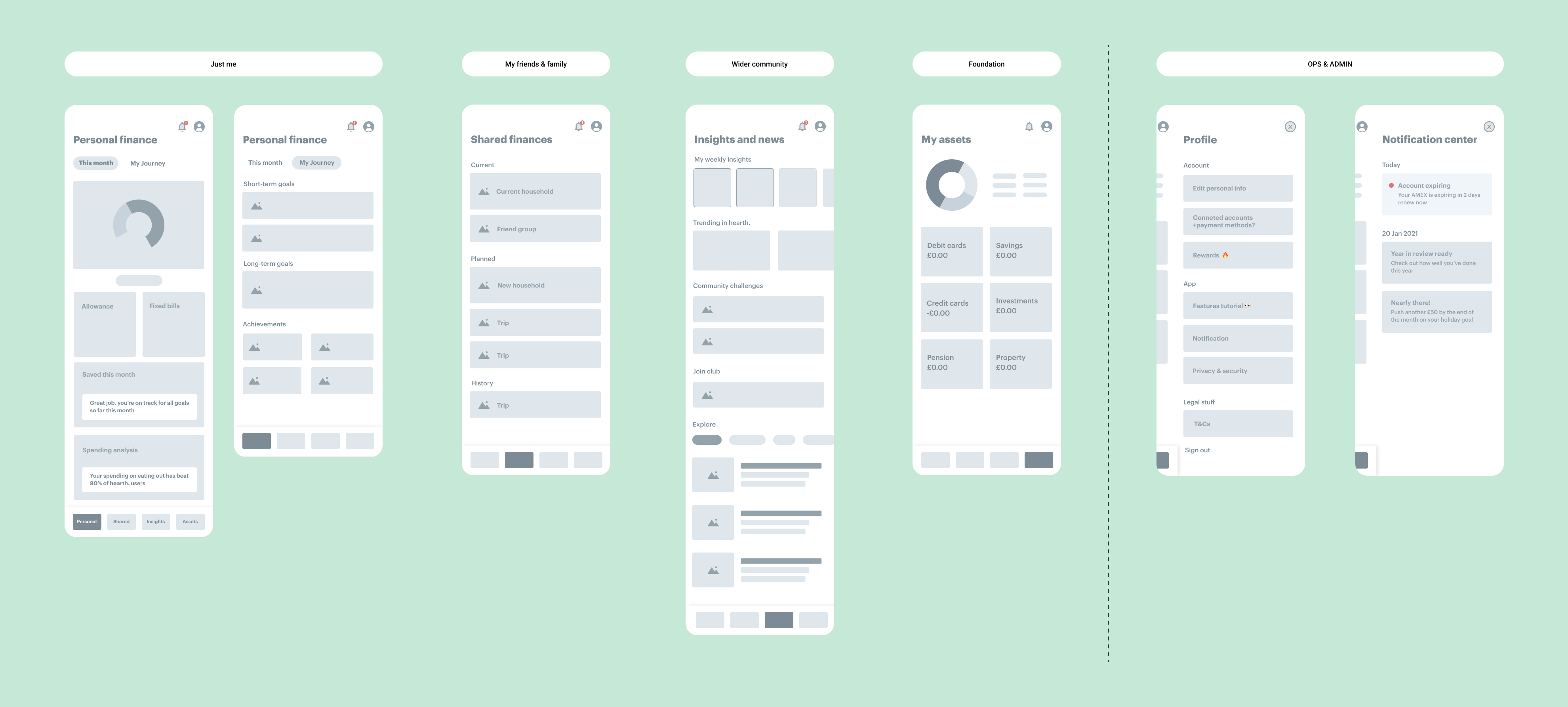
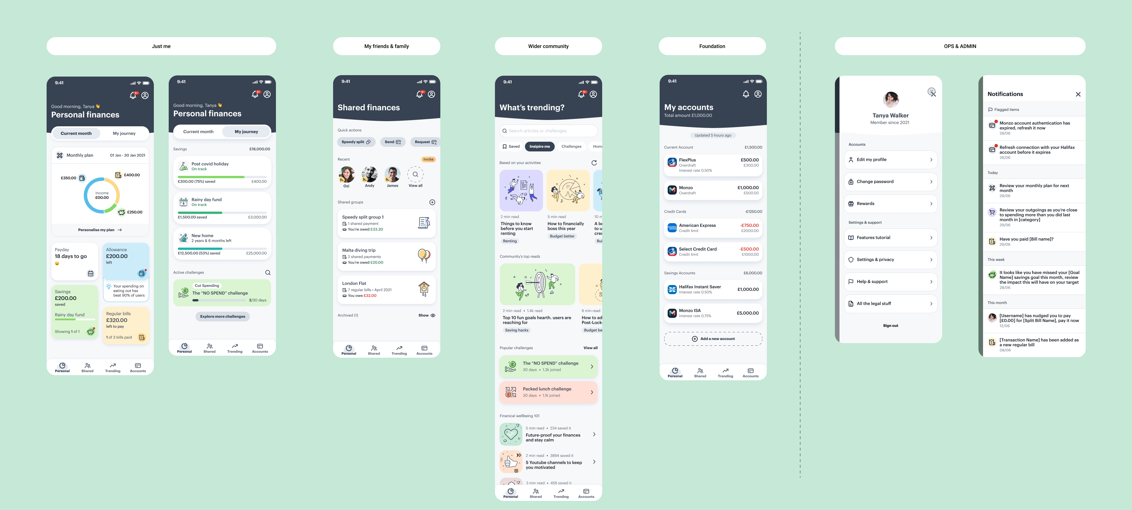
*A peek at how wireframes helped to transform ideas into high-fedility designs
02 ITERATION /
Present insights at relevant touchpoints
Having tested the APIs and back-end services in the MVP phase, we knew we can generate a diverse range of spending insights if a user connects their bank accounts in the app. 'When' and 'how' to present those becomes a new challenge.
I came up with this new way of interaction, aiming to make it easier for users to consume and act upon insights.
03 ITERATION /
Shared finance space v2.0
Through interviews during the MVP pilot, we identified a strong user desire to take more control in shared money. In MVP we only catered for shared household bills. This triggered users' talk about the need to also manage group trips, events and ad-hoc payment splits.
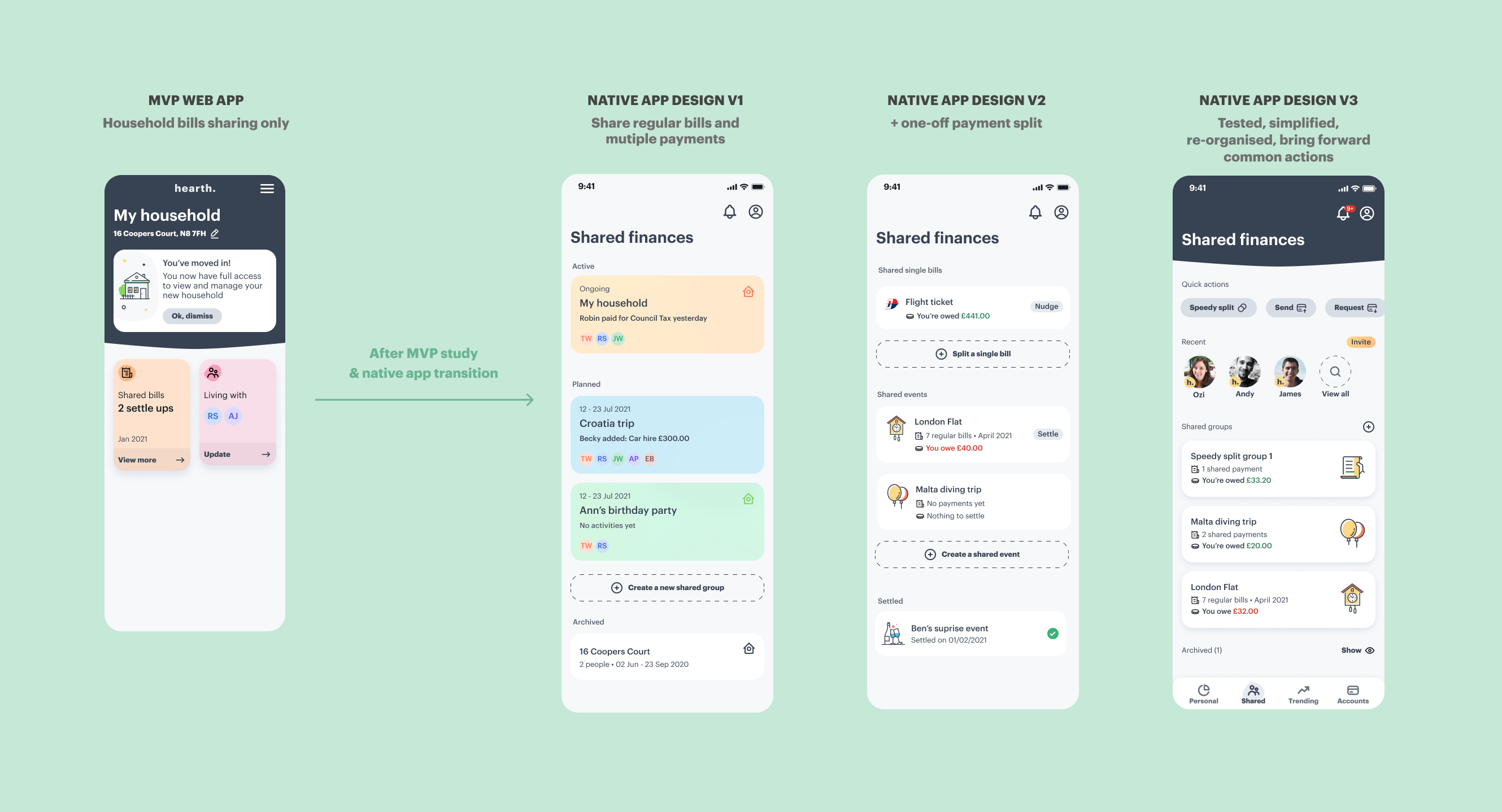
First-time user experience in Shared Finance
Search, add and invite friends to hearth.
Quick money split with mutiple friends
05 NEW /
'What's trending' in the community?
The aim of this new part of the app is to ease away people's loneliness and anxiety when it comes to finances. The designs focus on helping users improve financial well-being.
06 NEW /
Interaction experiments
Looking at opportunities to build a stronger brand image in visuals.
a) Building the first impression of the brand hearth.
b) Bringing in a little excitement to group finance
a)
b)
The hearth. design system
I was the sole designer of the team when it's first created. As the design team expands, we managed it together and formed a simple annotation system for the benefit of the whole team in delivery.
Aftermath & Retrospective
The team is currently preparing for native app launch on both ios and android platforms.
01/ Becoming a design leader
Finding a balance between design, leadership and management is the most challenging part for me in this role.
It was tough the first few months when I worked long hours trying to fill every gap in the process, making rapid decisions and managing ever-changing expectations between business and users.
The turning point is when I learned when and how to ask for others' input. I realised a leader is not to fix every single issue but to influence and enable others so that collaboratively the whole team knows how to move in the right direction.
Thanks to my amazing peers who selflessly mentored me through the times when I felt lost and believed in me all along.
02/ Product road mapping
Creating and developing a product roadmap was a new experience for me. At first, I was shocked at how many decisions there are to make and how hard was to estimate design efforts. Listen to more perspectives doesn't necessarily mean quick or easier decisions.
I've become more thoughtful, brave and self-trusting after this experience. I also believe that openness and regular team alignment is key. As the team scales, clear and frequent communication throughout the process is desirable to keep the project running as efficiently as it can be.
03/ Don't try to make things too smart
This is a team full of ideas and smart brains. There are times when we kept pushing for the product to be so smart but deviated from the original why. I've now learned to think twice about the necessity of intelligent tech, balancing with how users feel and their ultimate goal.
04/ Managing others
"It's great that I have a manager whom I also see as a friend." - Eunbi, one of my direct reports.
Being a people person is an advantage I have in managing others. The hard part is to balance this with all the rest of my responsibilities and having to self-learn. Books and best practices were the only resources I relied on to better recruit, operate and develop a team. Always listen, be transparent and be empathetic are qualities I try to accomplish as a manager.
More selected projects
OpenOvenProduct design
Deliveroo Developer PortalProduct design
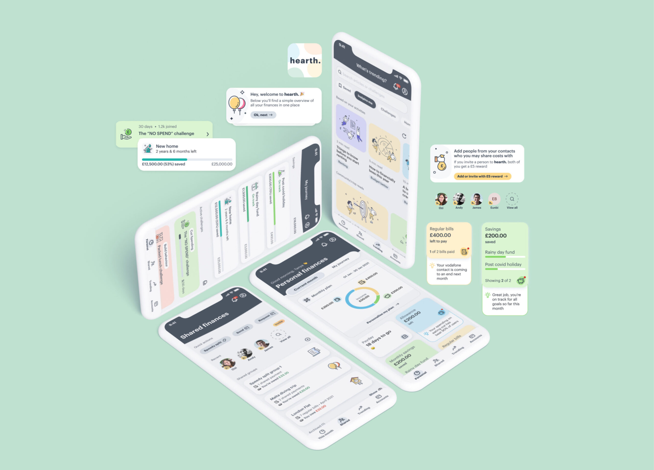
hearth.Product design
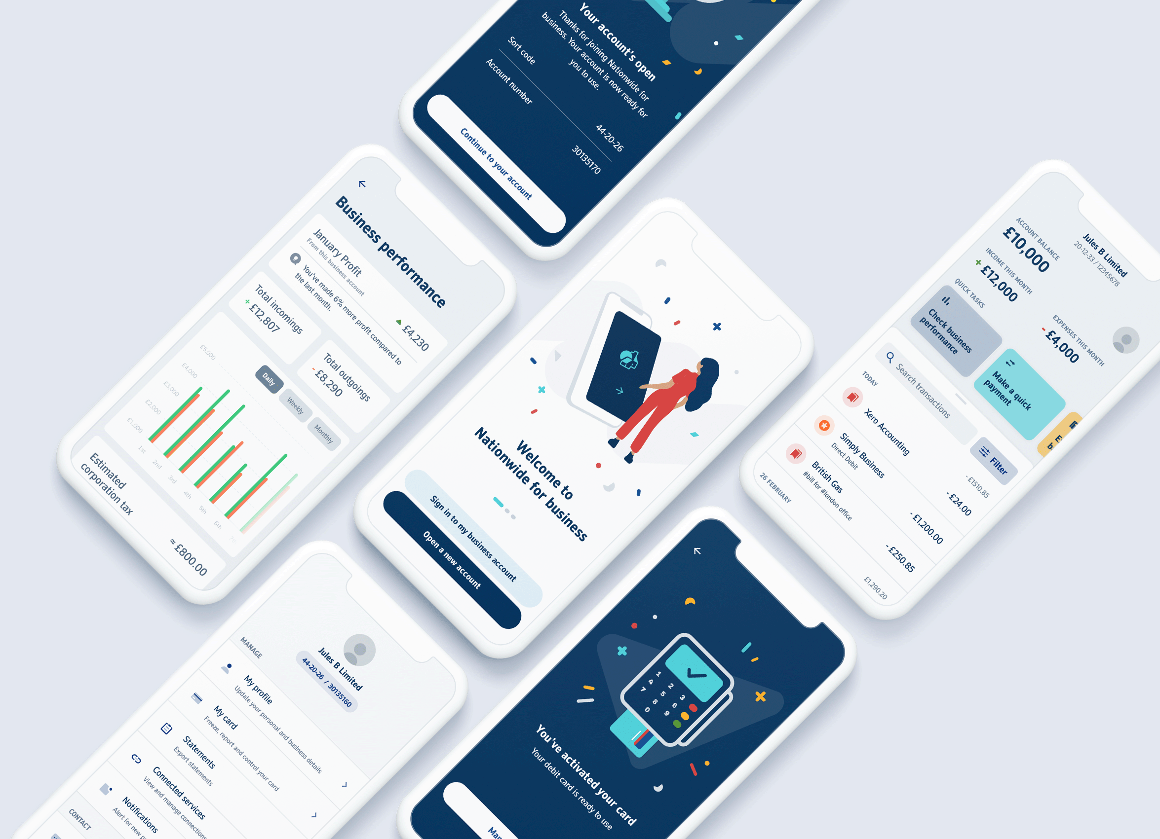
Nationwide for businessProduct design
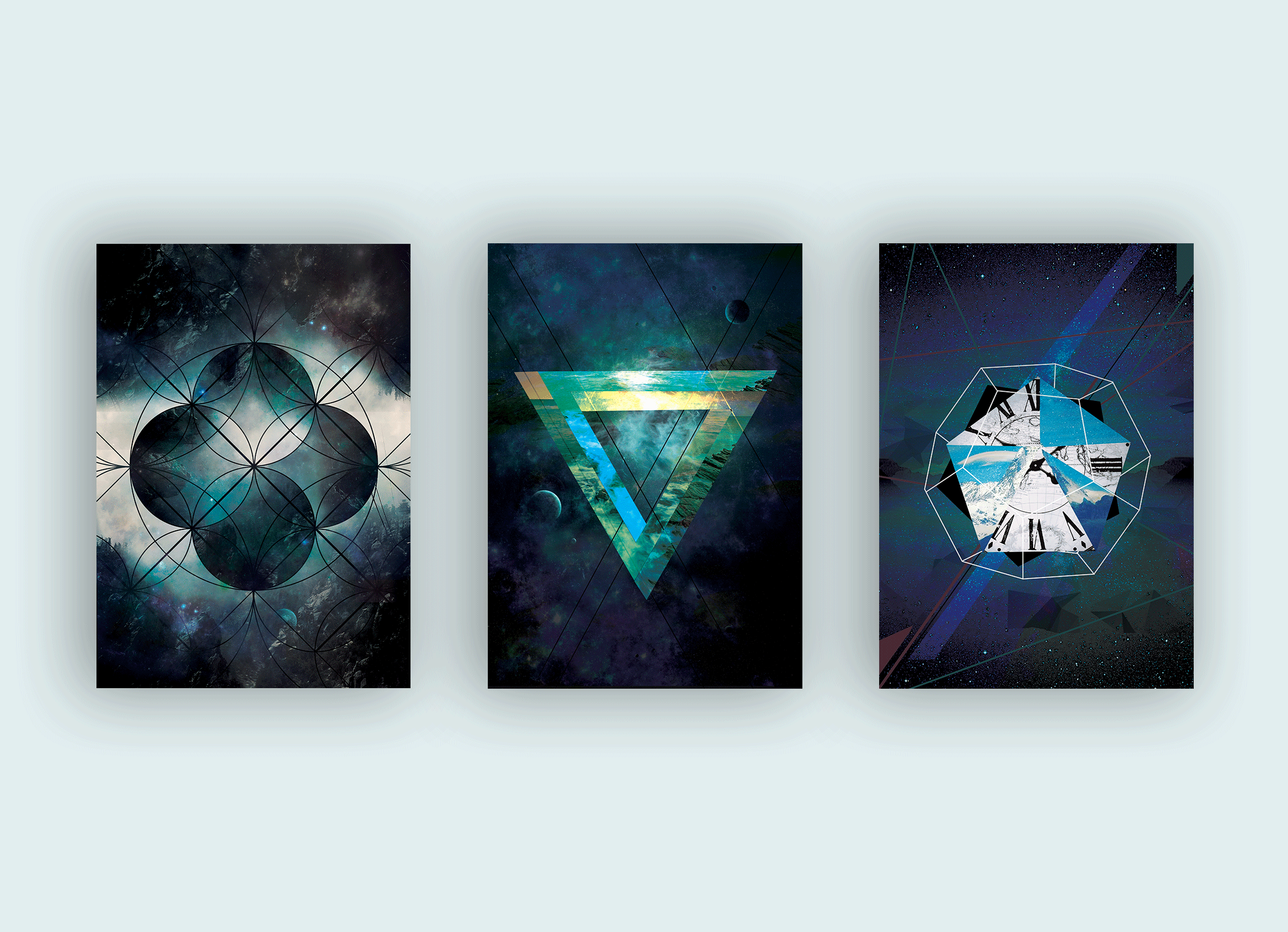
Space, time and universeCollage, graphic design
Open mailbox
Open mailbox
Become a friend
Become a friend
© 2026 Lakita Chen. All rights reserved.
© 2021 Lakita Chen. All rights reserved.
© 2021 Lakita Chen. All rights reserved.
© 2021 Lakita Chen. All rights reserved.


